App Themes
Customize the look and feel of RightPlace with built-in themes or your own color palette
RightPlace ships with a set of built-in themes and lets you create fully custom themes using the OKLCH color model. Open Settings > Theme & Appearance to browse themes, adjust text size, and toggle platform-specific appearance options.
Appearance Settings
At the top of the Theme & Appearance page you’ll find global appearance controls:
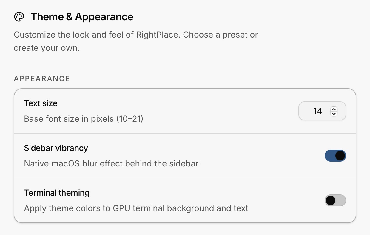
- Text size: a number input (10–21 px) that sets the base font size across the entire app
- Sidebar vibrancy (macOS only): enables the native macOS blur effect behind the sidebar
- Terminal theming: when enabled, the GPU terminal adopts your theme colors instead of the standard ANSI palette
Built-in Themes
RightPlace includes seven preset themes - five dark and two light.
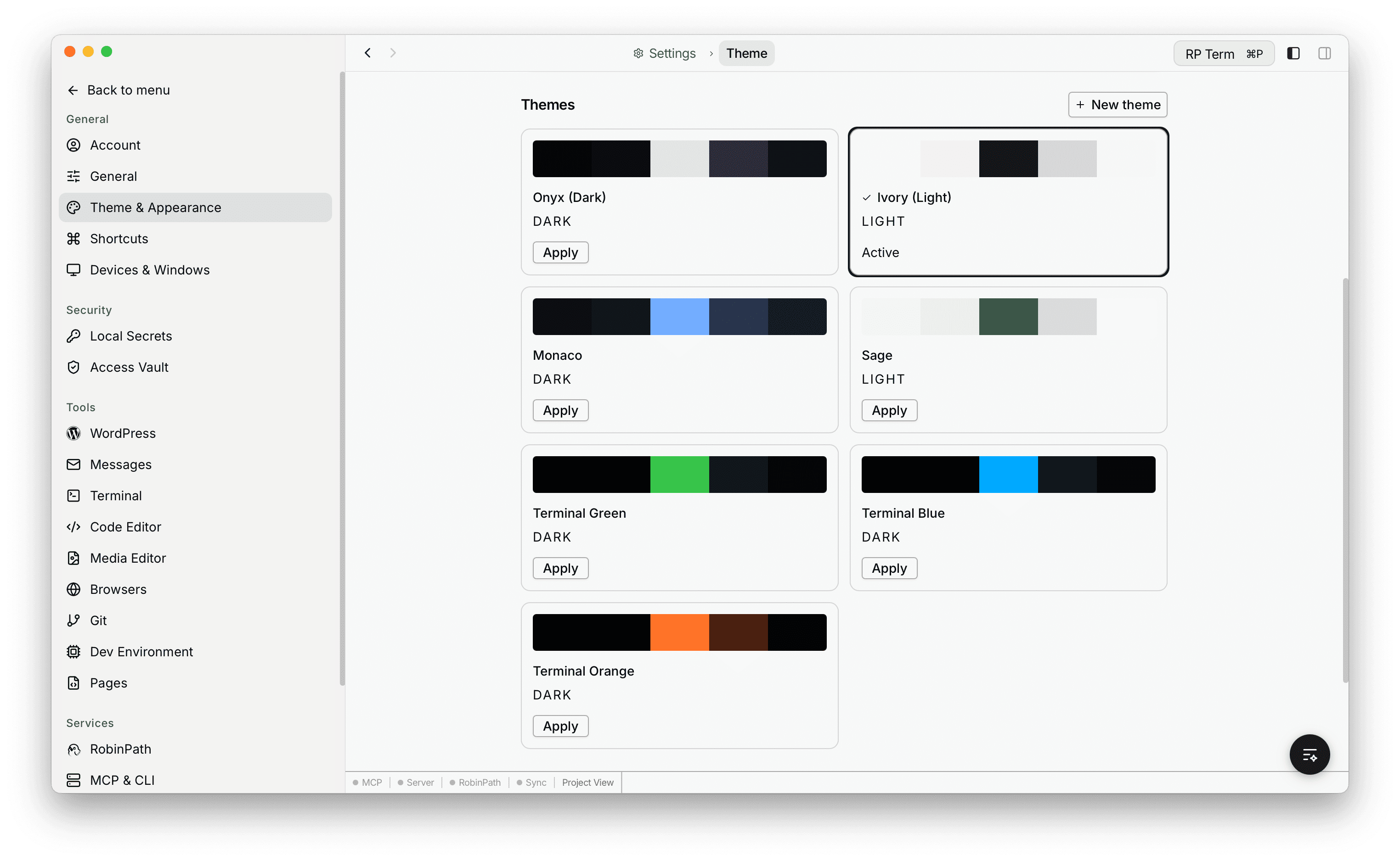
Dark Themes
| Theme | Description |
|---|---|
| Onyx | Neutral, minimal dark theme with purple-gray accents |
| Monaco | Blue-tinted dark theme with a professional feel |
| Terminal Green | Retro phosphor-green terminal aesthetic |
| Terminal Blue | Modern blue monochrome terminal look |
| Terminal Orange | Warm amber/orange terminal tones |
Light Themes
| Theme | Description |
|---|---|
| Ivory | Clean, high-contrast light theme with neutral blacks |
| Sage | Green-tinted light theme with a natural, calming feel |
Each card shows a color preview bar, the theme name, a DARK or LIGHT badge, and either an Apply button or an Active label. Click Apply to switch instantly.
Custom Themes
Click + New theme in the top-right corner to create a custom theme. The new theme starts as a copy of the currently active theme and opens an inline color editor.
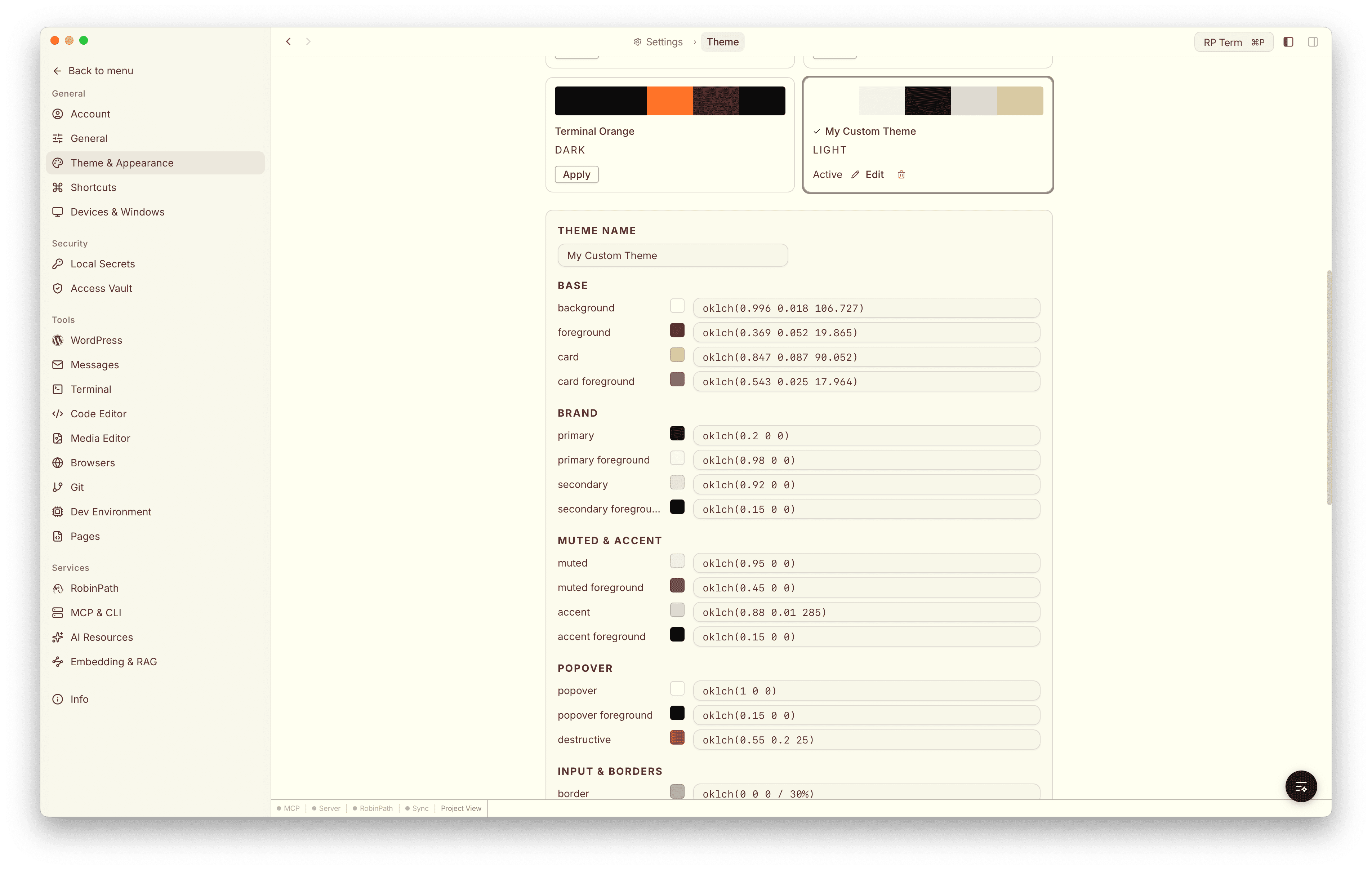
Color Groups
Every theme is defined by a set of color tokens organized into groups:
| Group | Tokens |
|---|---|
| Base | background, foreground, card, card foreground |
| Brand | primary, primary foreground, secondary, secondary foreground |
| Muted & Accent | muted, muted foreground, accent, accent foreground |
| Popover | popover, popover foreground, destructive |
| Input & Borders | border, input, ring |
| Sidebar | sidebar, sidebar foreground, sidebar border, sidebar primary, sidebar primary foreground, sidebar accent, sidebar accent foreground, sidebar ring |
| Effects | glass, glass border, header border, pane |
| Drag & Drop | drop valid, drop invalid |
| Charts | chart 1–5 |
| Scrollbar | scrollbar thumb, scrollbar thumb hover |
Each token has a color swatch and an editable OKLCH value field. Click the swatch to open the color picker, or type a value directly.
OKLCH Color Picker
The color picker supports three input modes:
- OKLCH - sliders for Lightness (0–100 %), Chroma (0–0.4), Hue (0–360), and optional Alpha
- RGBA - sliders for Red, Green, Blue (0–255), and Alpha (0–100 %)
- Hex - a saturation/value gradient square, a hue strip, and a hex input field
Changes apply live as you adjust colors, so you can see the effect across the entire app in real time.
Managing Custom Themes
- Edit: click Edit on any custom theme card to reopen the color editor
- Delete: click the trash icon to remove a custom theme. If the deleted theme was active, the app reverts to the default dark theme.
- Preset themes cannot be edited or deleted.
How Themes Work
All theme colors are stored as CSS custom properties using the OKLCH color model. When you apply a theme, RightPlace sets these variables on the root element so every component picks up the new palette instantly.
Theme settings are persisted locally and restored synchronously on launch, so there is no flash of unstyled content when the app starts.